
You should spend about 20 minutes on this task.
The pie charts below show the percentages of people in Australia who preferred five different types of exercise in 2010 and 2020.Summarise the information by selecting and reporting the main features, and make comparisons where relevant.
Write at least 150 words.
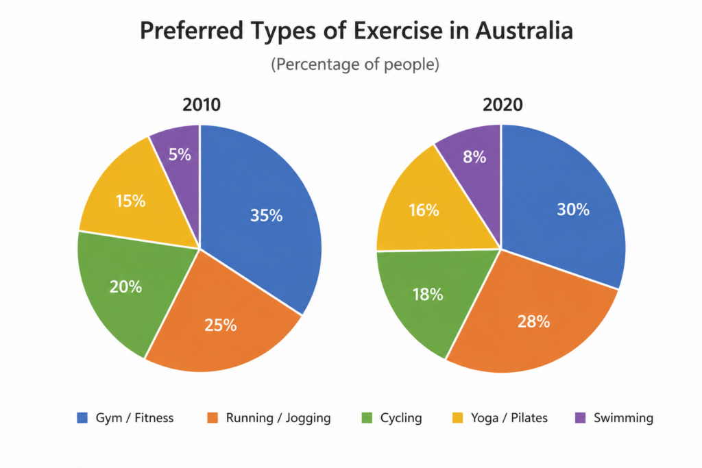
The pie charts compare the proportions of people in Australia who preferred five different forms of exercise in 2010 and 2020.
Overall, gym and fitness activities were the most popular choice in both years, although their share decreased over the period. By contrast, running, yoga and swimming became more popular, while cycling experienced a slight decline. Swimming remained the least preferred activity despite its increase.
In 2010, 35% of Australians preferred going to the gym or doing fitness activities, making this by far the most popular option. Running and jogging ranked second, accounting for a quarter of people, while 20% chose cycling. Yoga and Pilates were preferred by a smaller proportion, at 15%, whereas swimming was the least popular activity, at just 5%.
By 2020, the proportion choosing gym and fitness had fallen by five percentage points to 30%. Meanwhile, running and jogging increased slightly to 28%, narrowing the gap between the two most popular activities. Cycling saw a small decrease from 20% to 18%, while the figure for yoga and Pilates edged up to 16%. Although swimming continued to account for the smallest proportion, its popularity rose from 5% to 8%.
Vocabulary to highlight
- the proportions of people — the percentages of people
- forms of exercise — types of exercise
- the most popular choice — the activity preferred by the largest percentage
- their share decreased — their percentage fell
- by contrast — introduces an opposite trend
- experienced a slight decline — decreased a little
- remained the least preferred — continued to be the least popular
- making this by far the most popular option — showing that it was clearly the leading category
- ranked second — had the second-highest figure
- accounting for a quarter of people — representing 25%
- a smaller proportion — a lower percentage
- had fallen by five percentage points — decreased from 35% to 30%
- narrowing the gap — making the difference between two figures smaller
- saw a small decrease — fell slightly
- edged up to — increased slightly to
- continued to account for the smallest proportion — remained the category with the lowest percentage