
The bar chart below compares the percentages of Canadians in five different age groups who donated to charitable organisations in 2000 and 2015.
Summarise the information by selecting and reporting the main features, and make comparisons where relevant.
Write at least 150 words.
You should spend about 20 minutes on this task.
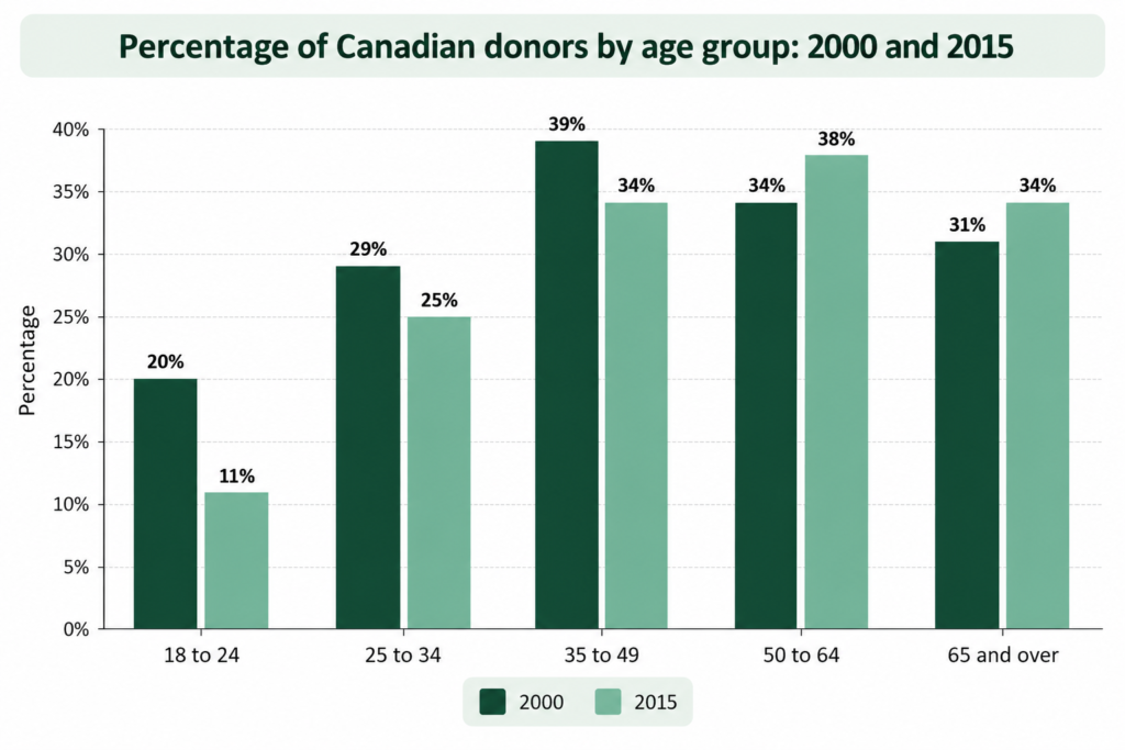
The bar chart compares the percentages of Canadians in five age groups who donated to charitable organisations in 2000 and 2015.
Overall, the proportion of people donating to charity was lower in 2015 than in 2000 among the three youngest age groups, whereas the opposite was true for the two oldest groups. While those aged 35–49 recorded the highest donation rate in 2000, the 50–64 age group had the highest figure in 2015. The youngest group had the lowest percentage in both years.
In 2000, approximately 39% of Canadians aged 35–49 donated to charitable organisations, the highest proportion among all age groups. The corresponding figure for those aged 50–64 was around 34%, compared with 31% of people aged 65 and over. By 2015, the percentage for the 50–64 age group had risen to approximately 38%, overtaking the 35–49 group, whose figure stood at 34%. The proportion of donors among those aged 65 and over also reached approximately 34%, matching the rate for the 35–49 age group.
A different pattern can be observed among younger Canadians. In 2000, 20% of those aged 18–24 donated to charity, compared with approximately 29% of people in the 25–34 category. In 2015, these figures were lower, at around 11% and 25%, respectively. Thus, the difference between the two youngest groups remained evident in both years, with the 25–34 age group consistently recording a higher donation rate.
Vocabulary to highlight
compares the percentages of — describes differences between numerical values
the figures are given in percentages — explains the unit of measurement
over the period shown — during the period presented in the chart
the proportion of people donating — the percentage of people who made donations
recorded the highest figure — had the largest percentage
the lowest proportion — the smallest percentage
the opposite was true — the contrasting pattern occurred
the leading age group — the group with the highest figure
the corresponding figure — the equivalent value for another group or year
stood at 39% — was at a particular level
a different pattern can be observed — introduces contrasting information
rose from X to Y — increased from one value to another
fell from X to Y — decreased from one value to another
overtook the X group — surpassed another group in the ranking
reached approximately X% — attained an estimated percentage
matching the rate for — reaching the same percentage as another group
the figures were lower in both cases — both values were smaller
a decrease of X percentage points — the arithmetic difference between two percentages
a similar pattern was observed — another category showed a comparable result
respectively — connects figures to categories in the same order