
You should spend about 20 minutes on this task.
The pie charts below compare the percentages of people using five different methods of commuting to work in Japan and Brazil. Summarise the information by selecting and reporting the main features, and make comparisons where relevant.
Write at least 150 words.
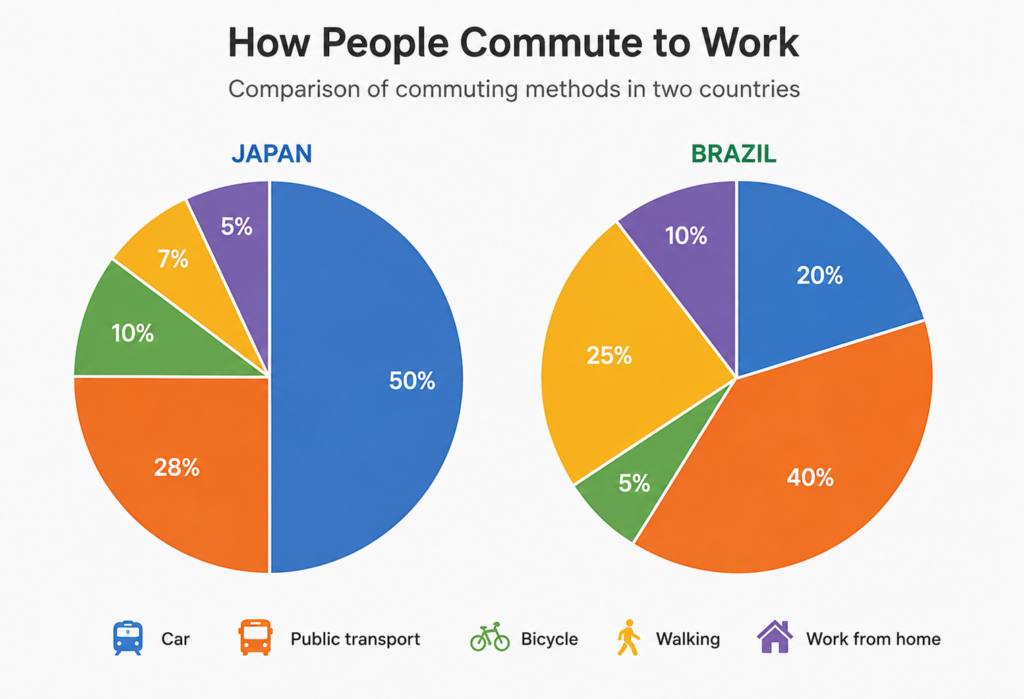
The pie charts compare the proportions of people who use five different methods of travelling to work in Japan and Brazil.
Overall, cars are by far the most common means of transport in Japan, whereas public transport is the most popular option in Brazil. Another noticeable difference is that walking is considerably more common among Brazilian commuters, while cycling accounts for a relatively small proportion in both countries.
In Japan, exactly half of commuters travel to work by car, making it the dominant form of transport. Public transport is the second most popular option, accounting for 28% of workers. Much smaller proportions commute by bicycle and on foot, at 10% and 7% respectively. Working from home is the least common option, representing just 5% of the total.
By contrast, 40% of people in Brazil use public transport to get to work, which is 12 percentage points higher than the figure for Japan. Walking is the second most common method, at 25%, compared with only 7% in Japan. Cars account for a further 20%, less than half the Japanese figure. Finally, 10% of Brazilians work from home, while cycling is the least popular option, at only 5%.
Vocabulary to highlight
- the proportions of people — the percentages of people
- methods of travelling to work — ways of commuting
- by far the most common — much more common than the other options
- means of transport — method of travelling
- another noticeable difference is that — useful for introducing a key comparison
- considerably more common — much more common
- accounts for — represents
- a relatively small proportion — a comparatively low percentage
- exactly half of — precisely 50%
- the dominant form of transport — the most commonly used type
- the second most popular option — the category with the second-highest percentage
- much smaller proportions — significantly lower percentages
- representing just 5% — accounting for only 5%
- by contrast — introduces an important difference
- 12 percentage points higher than — e.g. 40% compared with 28%
- compared with only — useful for emphasizing a difference
- less than half the Japanese figure — useful comparative language for 20% versus 50%
- the least popular option — the category with the lowest percentage